Case study01
Dating Retreat in the Galilee
A brand and website for a boutique dating retreat in the Galilee, made to feel like the retreat itself: warm, unhurried and real.
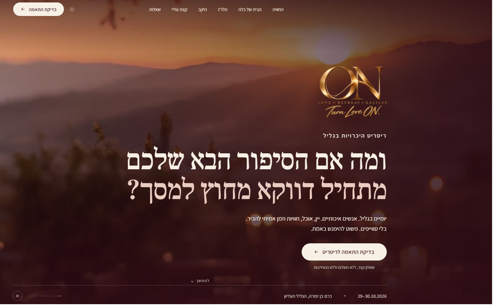
01The context: Two days in the Galilee, for people ready to meet for real.
ON is a boutique dating retreat: a small, balanced group of single women and men, two days in the Upper Galilee, with wine, food and real time to get to know each other.
The website is where people meet ON first. It had to carry the same promise: quality, warmth, trust and human connection, without losing the premium feel.
The format, as the site presents it
- Two days
- of shared experience in the Galilee
- 24
- participants only, an intimate group
- 12 + 12
- women and men, a balanced group
- 30+
- single women and men, aged 30 and up
02The problem: The challenge was mostly what it must not be.
- A dating app.
- A generic event page.
- A wedding website.
- A wellness landing page.
It had to attract the right people, and make the retreat feel real, intimate and intentional before anyone arrived.
03Direction: Quiet luxury, in warm materials.
The identity rests on a few materials: a gold monogram, the colors of wine and evening light, a serif voice for the questions that matter, and photographs of real places.

- Cream#F6F0E5
- Blush#F1E1D5
- Bordeaux#6D1F2D
- Wine#501320
- Gold#C39A5B
- Ink#231A16
04From brand to website: From brand identity to a working website.
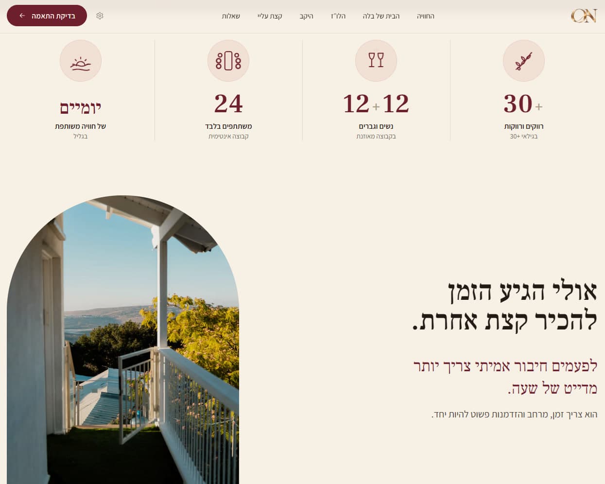
A Hebrew, right-to-left website, from the opening question to the suitability check, on desktop and on a phone.
Structure
Six destinations, and one clear action.
- 1The experience
- 2Bella’s house
- 3The schedule
- 4The winery
- 5About me
- 6Questions
- Check your fit
On a phone
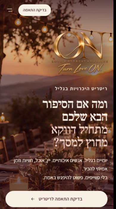
The opening is recomposed for the phone, not shrunk: the mark leads, the question sets over four lines, and the action spans the bottom of the screen.
05Key decisions: Six decisions that shaped it.
- 01
Outside the language of dating apps
The opening screen leads with a question, and its supporting line says what the retreat is not.
No swipes. Just meeting for real.
בלי סוויפים. פשוט להיפגש באמת.
- 02
A softer, editorial rhythm
The story section gives each idea room: a short heading, one sentence in bordeaux and a single supporting line.
- 03
The Galilee as part of the story
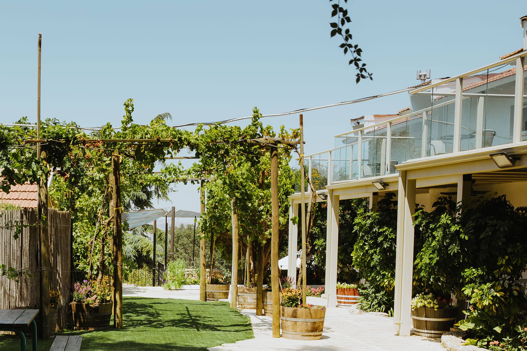
The opening screen names the date and the place, and the place has chapters of its own: the house and the winery.
- 04
Exclusive, and still warm
The limits are stated plainly: 24 participants, 12 women and 12 men, aged 30 and up. Each number sits under a soft icon, with a short line beneath it.
- 05
A suitability check, not a booking
The action is a suitability check, not a booking: a short questionnaire, no payment and no commitment. The same button also sits in the site’s header.
- 06
One identity, desktop and phone
On a phone the gold mark still opens the page, over evening light, with the same spaced line beneath it.
06Film: The brand in motion.
The mark, the promise in a few words, the Galilee and the website, in one short film.
07Details: Up close.
The ribbon line that ties the two letters Numbers in the site’s serif, a small, light plus and a soft icon A spaced line before the headline One action, cream on the evening photograph and bordeaux on cream On a phone, the action spans the screen
08Result: From identity to launch.
The identity and website came together as one complete digital experience, now live across desktop and mobile.
Visit live site ON (opens in a new tab)Next project02
המחלבה
Operational product
An operational workforce product for scheduling, management workflows and day-to-day operations.